The Tribute Journal
Funeral Program Cover Ideas: 18 Designs That Work
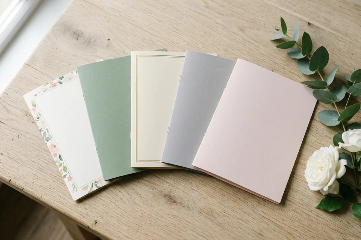
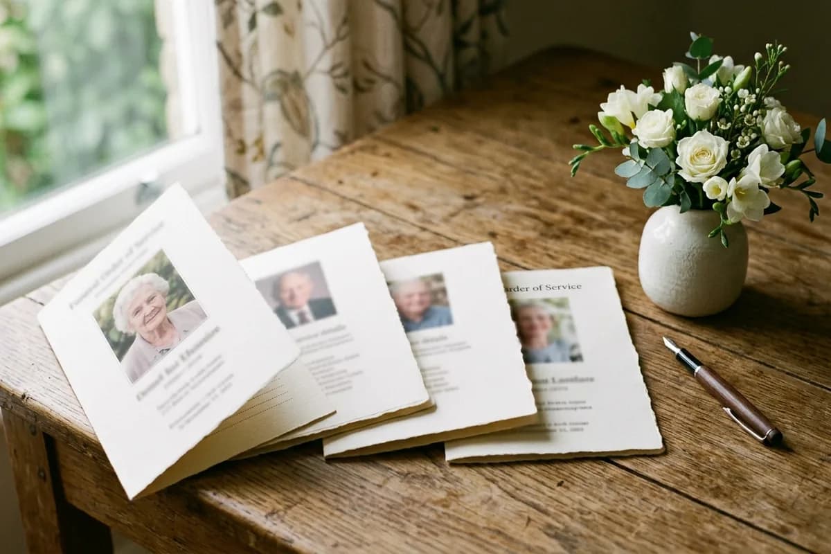
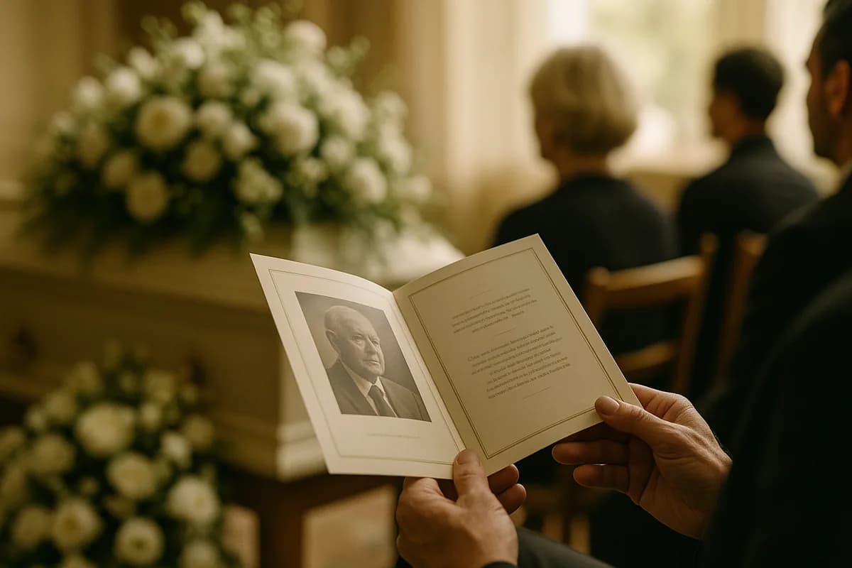
The cover does one job: it should look like the person. Everything else — the border, the color, the font — is in service of that. Below are eighteen cover designs that work, grouped by the four layouts they are all built on, plus the wording and the photo rules that decide how the finished cover actually looks in someone's hands.
Layout 1: full-bleed photo
The photograph fills the entire cover, with the name and dates set over it. Striking when the photo is strong and high resolution. Unforgiving when it is not.
- 1. Full portrait, text at the foot — the most common. Keep the lower third relatively plain so the name stays legible
- 2. Full landscape with a soft white band — a translucent white strip across the lower third carries the name without hiding the image
- 3. Duotone wash — convert the photo to soft sepia or a single muted tone. Rescues a mixed-quality photo and looks deliberate
- 4. Faded edges (vignette) — the photo fades to the paper color at the borders, so no hard rectangle. Gentle, and hides an awkward background
Layout 2: framed photo
A photograph sits inside a border on a plain background. The safest layout, and the one that suits the widest range of photographs — including old, small or slightly blurry ones.
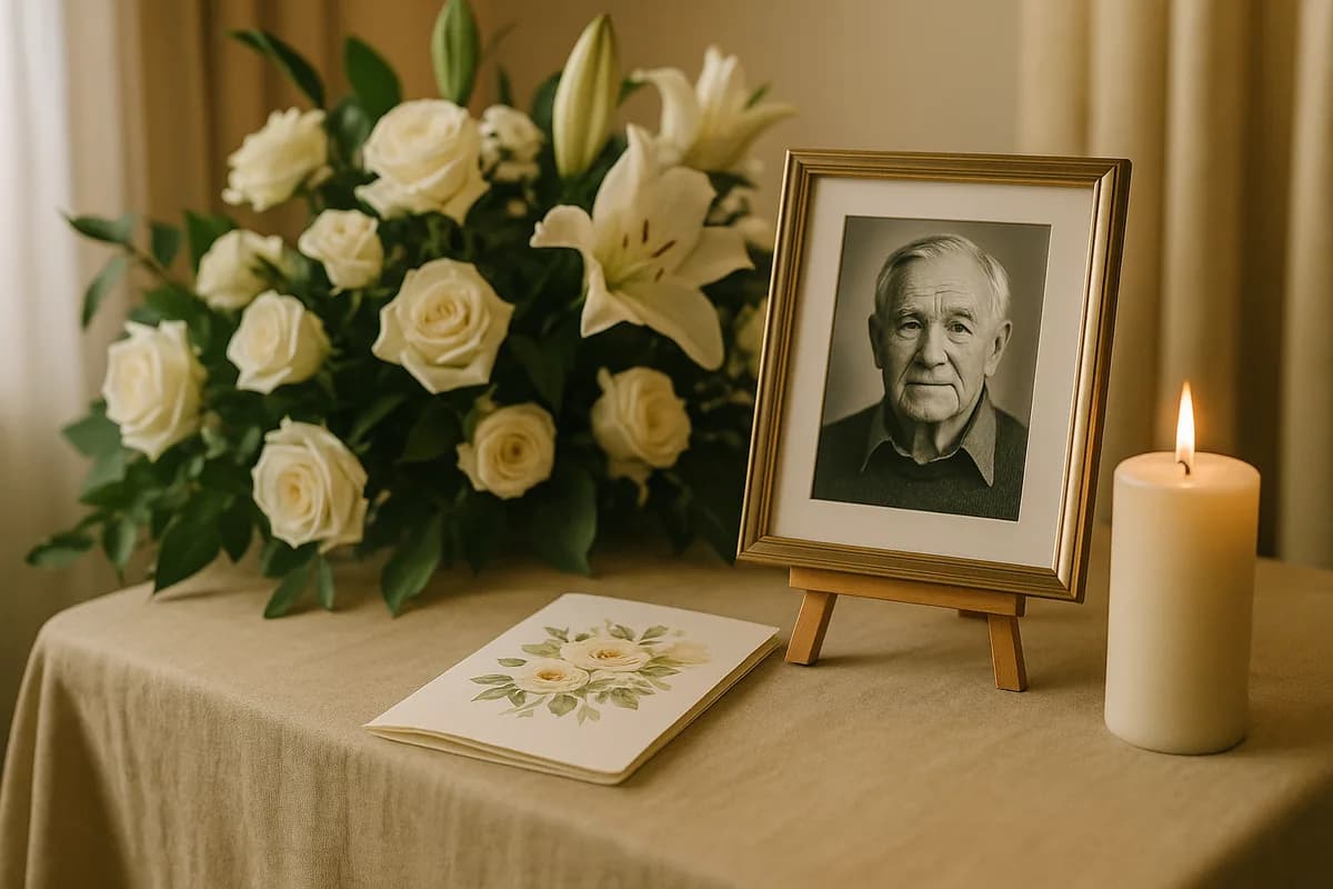
- 5. Thin gold rule — a single fine line around the photo and a second just inside the page edge. Formal without being heavy
- 6. Watercolor floral border — soft botanical edges framing the photo. The most requested style for a mother or grandmother
- 7. Oval or arched photo — an arch-topped or oval crop reads as traditional and instantly softens a stiff portrait
- 8. Eucalyptus and greenery corner — greenery in two opposite corners only. Modern, restrained, works for anyone
- 9. Single-color block — a deep sage, navy or charcoal panel behind a white-bordered photo. Strong and contemporary
Layout 3: photo-free
No photograph on the front at all. This is not a compromise — it is a deliberate and often more elegant choice, and it rescues you when the only photographs available are poor quality.
- 10. Name and dates alone — generous white space, one serif typeface, nothing else. Quietly confident
- 11. Single botanical motif — one sprig, one lily, one olive branch, centered above the name
- 12. Scripture or a line of verse — a short line set small above the name, doing the emotional work a photo would
- 13. Textured or linen stock — let the paper itself be the decoration; print only in one ink color
- 14. Landscape instead of portrait — the lake, the mountain, the garden they loved, rather than their face. Often more moving than a portrait
Layout 4: split cover
- 15. Half photo, half color — image on the top half, solid color and text beneath. Clean and easy to lay out
- 16. Photo strip — three small photographs in a row across the middle, spanning different decades
- 17. Diagonal split — photo on one side of a soft diagonal, color on the other. The most modern option here
- 18. Photo with a small inset — a main portrait plus one small circular inset of them much younger. Families consistently love this one
Cover wording
The heading above the name sets the tone before anyone reads a word of the service:
- In Loving Memory of — traditional, always correct
- Celebrating the Life of — warmer, and right for a celebration of life
- In Memoriam — formal and brief
- A Life Well Lived — used alone above the name
- Forever in Our Hearts — softer, common on a back panel too
- Nothing at all — just the name and years. Increasingly the most elegant choice
A nickname in quotation marks does more than any adjective: *Margaret "Peg" Hollis*. For short lines to sit beneath the name, our in loving memory quotes are grouped by length.
The photo rules that actually matter
- 300 DPI at print size. A photo pulled from Facebook or a text message is usually 72 DPI and will look soft on paper even though it looked sharp on screen
- Check the crop before you fall in love with it. A portrait cropped to a square loses the shoulders; a landscape cropped to portrait loses the setting
- Watch the background. A busy kitchen behind the head is the most common problem; a duotone wash or a vignette fixes it without reshooting
- Do not enlarge a small photo. Scaling a 400px image to fill a cover produces visible blocks. Use it small and framed instead
- Scan prints at 600 DPI, not with a phone camera, if the only photograph is a physical one
Color, paper and how it prints
- Matte, not gloss — photographs read better and there is no glare under chapel lighting
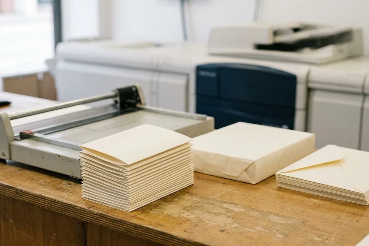
- 65–100 lb cover stock — anything lighter feels flimsy and shows print through from the reverse
- Colors print darker than they look on screen — if a shade matters, print one test copy before running a hundred
- Bleed — if the design runs to the edge of the page, the file needs 0.125 inches of bleed or you will get a thin white line. Retail counters such as FedEx Office printing accept a print-ready PDF and turn it around the same day
Where to actually get it printed, and what each option charges, is covered in funeral program printing. For the inside pages rather than the cover, see what to include in a funeral program, and for complete layouts panel by panel, our sample funeral programs.
Common questions
What goes on the front of a funeral program?
A heading such as "In Loving Memory of" or "Celebrating the Life of", the person's full name (often with a nickname in quotation marks), their birth and death dates or years, and usually a photograph. Some families use years only, and some use no photograph at all — both are correct.
What photo should you use on a funeral program cover?
One that looks like them rather than the most formal one available. A candid photograph where they are recognizably themselves almost always lands better than a stiff studio portrait. It needs to be 300 DPI at print size; if the only good picture is small, frame it rather than enlarging it.
Do you need a photo on the cover at all?
No. A photo-free cover — name, dates, one botanical motif or a line of verse on textured stock — is a deliberate and often more elegant choice, and it is the right answer when the available photographs are poor quality.
What color should a funeral program be?
Ivory, cream, soft grey and sage are the safe defaults. Printed materials bought through a funeral home fall inside the service and merchandise charges the National Funeral Directors Association reports in its median figures, which is why bringing your own file is usually cheaper. For a celebration of life, brighter colors are appropriate and increasingly common. Remember that colors print darker than they appear on screen, so run one test copy if the shade matters.
What size is a funeral program cover?
Most commonly 5.5 × 8.5 inches, which is a standard 8.5 × 11 sheet folded once. That size is handled by every print counter without questions and fits comfortably in a hand or a coat pocket.